|
 |
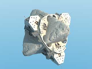
An update on my Escher print interpretation.
I was clearly lying in the previous post, I wasn't happy with the building
geometry at all! It's a bit better now. I've made the whole thing bigger,
put loads of windows and doorframes and detail guff like that, added
flagpoles, textured the floor a bit better (not that you can tell at this
resolution) and just generally tidied up. I expect my careful wall
texturing is completely invisible at this zoom factor - if anyone can make
it out I'd be interested in your comments. It's a kind of patchy, speckled
surface such as might be seen on concrete from a distance.
I'm almost happy with the boulder.
Still to do: some people for the verandahs, trees and bushes for the
boulder, maybe some rock strata for the boulder? Not sure if that would
work. Must investigate. I also think I'm a too bit close and wide-angle -
there's too much perspective on the nearside vertices. I need to move the
camera back a little.
I've done bushes and trees, I just haven't written a macro to place them
yet. Discovered the trace() function last week - genius! I got a bit bogged
down with the trees - I know there are some very good tree macros out
there, but I like to do it all myself if I can. :)
Anyway, comments....?
Bill
Post a reply to this message
Attachments:
Download 'planetoid2.jpg' (169 KB)
Preview of image 'planetoid2.jpg'

|
 |


![]()